Marketing Fashion
Marketing Fashion - Fair Trade clothing
Branding:
Slogan - Fair Fashion
Planned Brand Clothing:


Statement of intent:
My target audience is for young adults and teens which means I need to make the products fresh and original to appeal to the younger generations. For the product to appeal to my target audience the typography of the product must be short like a small word or letters to represent the brand well which is why I have chosen my initials which is short and easily representable to my brand. The font is also very important to the brand as I have used English 157 BT which is an old style of writing but this shows the customer that the product is a quality product with authenticity. For my brand, I have decided to call it 'JH' or Jack Holliday. This is because most popular designers use their name as their brand like, Louis Vuitton, Jack Wills and Tommy Hilfiger. With the brand name comes the logo which is a gold tiger with red eyes and tongue, with a black background. I thought that the black and gold complimented each other and that they are very popular colours to use. The red also works well as a ruby colour showing that Fair-Trade clothing can be stylish with the gold and ruby. Also included in the logo are the initials of the brand in white which helps it to stand out. All four colours that I have used work well together and help each other to stand out. This will help customers remember the logo and brand. Because of the logo, it allows me to choose to pick different coloured clothes. For my first products, I have chosen to make hats and t-shirts because they are very popular with younger generations. The products will be more suited to males because of the style; the white and black are unisex colours but because of the logo it makes the clothing more appealing to a male audience rather than a female audience. How these products will make a profit; the profit will be made by me buying the cotton at a fair price from the Fair-Trade farmers, then I will use workers to make the clothing with help from machines and finally sell the clothes off for a higher price. 10% of the money will go to the Farmers as well as them getting paid for the clothing and another 10% will go to the WWF.
Pitch:
I am linking it to Fair-Trade by only using Fair-Trade materials for my clothing; the resources will be taken from a Fair-Trade cotton field in Uganda. My tiger logo links to Fair-Trade as it refers to nature. 10% of the profits will also go back to the farmers to help them. As well as money going to Fair-Trade it will be going to the WWF because we believe that animals aren't being treated fairly so money will go to protecting them.
Planning for Photo-shoot:

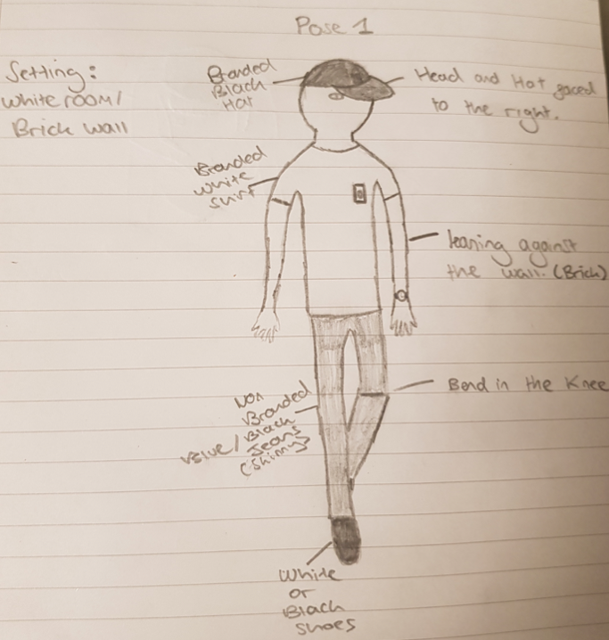
For the photo-shoot, I have chosen a brick wall to be the setting/background of the photo-shoot. I have chosen an urban background as it compliments the clothes that I have chosen to represent my brand. The clothes and the style of the clothes are street influenced, the brick wall is used quite a lot as well in photo-shoots because urban is very popular in today's fashion. There will be two poses that I will be using with a third to show off the back of the t-shirt.
Mock Poster:

Contact Sheet:

Final Product:


Final Product:


Evaluation:
In my two posters, i have gone for a very simple style of branding. I have used the colours of my branding to implement on my work. The gold and black in the logo really stand out on the clothing I have chosen because the black blends in with the colour of the clothing and the gold give a light, vibrant colour to add to it. The typography of the piece is the wording on the side and the pricing of the clothing. I have stuck with an authentic style of writing, similar to the writing on the logo. This will help customers to associate the writing with my brand. It links in with the fair trade aspect because the clothes are 100% fair trade. It appeals to my target audience because of the popular colours and writing that goes with the poster. The setting of the photoshoot gives the photo and edgy vibe. The mise -en - scene of the piece is that it gives the photo a young vibe but also with an old-fashioned twist because of the writing. The final product and the planning are very similar, the style is exactly how I wanted it and the clothing is the same but with different colours. the setting is where I wanted it to be set and the clothes look like my planned work. In the pictures, i used photoshop to get rid of any entities that I didn't want. The first entity is that my jumper was in the shot but with the magic of photoshop it allowed me to get rid of the clothes and make the clothes the highlight of the picture. If I could do something differently I would choose not to do the hat because I feel it really does not do the picture justice and it takes away the model from the pic.


Comments
Post a Comment