The Big Issue Cover analysis
The Big Issue Cover analysis
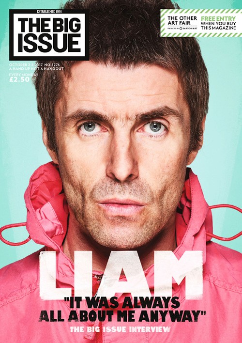
The Masthead in this Big Issue cover is smaller than the headline which is unusual for a magazine as usually the masthead is supposed the stand out to the audience so that they are able to recognise it as their favourite magazine. The colours in the cover of the Big Issue are quite vibrant and stand out to the audience. The colours are clearly used to represent Liam Gallagher as he is an out going and wacky character which shows that the colours are quite out there which reflects Liam Gallagher. They have taken a picture of him pouting which is famous of him on stage and when pictures are take. The clothes that he is wearing are quite vibrant and it is a wind breaker which in most pictures of him he is wearing a windbreaker of some kind, so they have really take in his style of dress and his personality into consideration when he was asked to take a photo. To show he is the main story in the magazine they have put him right on the front cover taking up the page which could suggest that he is a big part of the magazine or that it could reflect his big personality The way that he has looked at the camera suggests that he is looking at you which makes the audience feel as though they are meeting him, so if you were a fan this may make you feel like you feel accepted by him. Also on the front cover of the Big Issue they have taken a quote from Liam Gallagher which is used to give a little preview to the audience so that they would want to read on further into the magazine. Below this they have said it is "The Big Issue Interview" which suggests to the reader that it may be a special kind of the Big Issue or a special addition of it. I would say the target audience for this front covers are fans of his work or middle aged men and women because of how old he is and his work. The capitalised writing of "LIAM" is the biggest writing on the page which stands out to the reader and represents him as a big star of the magazine. The bold and capitalised writing below "LIAM" is a quote inside the magazine presumably, with a different a different colour which is used to stand out from the "LIAM" text. The black writing also overlaps the white writing which suggests that the quote is from him and is used to link the name to the quote. Below the black text is some smaller white writing telling you it is "The Big Issue Interview" all in bold lettering which suggests that it isn't as important as the text above but it is notifying you that it is a special edition of the Big Issue. The white text in the top left stating the number of issues and the price is small and faded into the background which suggests that it isn't as important as the bolder, more visible text . They have done this because they don't want it to interfere with the main image.

In this front cover of the Big Issue it has Benedict Cumberbatch looking seriously at the camera in the clothes that he wears for Sherlock Holmes which straight away appeals to the readers of the magazine that like Sherlock Holmes. The dark background suggests to the readers that haven't watched Sherlock Holmes that it is quite a serious and dark program. The darkness of the photo also shows that age range that would be interested in this because if it is a dark/serious program then young children wouldn't be interested but youths or young adults would be interested. The way he looks down the camera at the reader suggests that he is in character when this was taken as the title suggests the main article is about Sherlock Holmes returning. The clothes that he is wearing are quite dark so they have clearly thought about the correlation between the TV show, the darkness of the show and the darkness of the character when picking the clothes a that he wears and even the pose/facial expression he uses. The front cover is quite dark but his face gives it light which suggests to the reader that he is the light of the magazine, the main star in it. Even if you hadn't watched the show you would know that he is a detective which shows the smart clothes that he is wearing represents his "Job" that he does in the show. Again in this issue of The Big Issue the logo is one of the elements on the page which seems like they are trying to downplay their log because they know the fans of the magazine don't care about the logo they care about the content inside the magazine. The text on the cover stands out to the reader, they have used the dark background to their advantage and they have used a very light and vibrant colour to stand out to the reader. They have put the yellow writing there to stand out to the reader but it is almost being ironic with the flashy writing and then saying don't panic because of a television show. Below the bright yellow writing is some capitalised text saying "CUMBERBATCH" in bold white writing. This is implying to the reader of the magazine that he is the big star in that days edition. It also is the opposite colour of the background which makes it stand out even more to the reader. Below all of the writing is a little banner with small writing which already suggests to the reader that they aren't the main stories. The have a small yellow arrow pointing to the banner showing that the Big Issue want you to read these but not as much as their main story. In the top right corner they promote their products from the Big issue shop, the corner is yellow to stand out to the reader.

This cover of the Big Issue is based around the new film King Arthur in 2017. The main cover shows the main character of the film, King Arthur or Charlie Hunnam. The picture is of him in the role of King Arthur and he seems to be in character. They have made him black and white which suggests to the reader that it is quite a dark film and his character is a simple character because of the white and black. The red background suggests that there will be a lot of violence in the film because usually in films red is associated with blood. Red is also a quite dark colour and on the cover it fades into a black so this also assists the point of the film being a dark film and not for the younger audience. Hunnam is looking quite serious in his photograph suggesting he is in character and showing that the film is a serious, adult film. The text they have used int he front cover is very big and bold to stand out to the reader so that they notice what the main story is. They have also used the yellow to stand out to the reader again which seems to be a common theme as it is a very vibrant colour, to stand out to the reader so that they know that it is an interview and that they can buy a Big Issue T-shirt. Their logo is again one of the smallest things on the front cover.


Comments
Post a Comment